


This is the Free-Form Content Block – H3
Notice that this box is narrower than the other blocks on the page. Make sure to place it somewhere where the extra white space helps the layout. You'll also want to balance out the blocks that have white and gray backgrounds, as well as the ones that are very text or image heavy.
This is a sub-heading in your content – H4
Notice how this page looks nice when you alternate between blocks with gray and white backgrounds. The amount of text you put here is up to you. This is the main content area of a detail page (T6). It can also be used on landing pages to provide more info. This is also where you can add product cards.


Other Types of Content
There are more types of content you can add to your page:
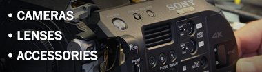
- Lists of items in various styles
- Videos
- Image sliders, example
- Tables (adding CSS is required and they are a pain – not recommended)
The Tabbed Panel is for adding logos (Example: Service page). A Call to Action panel is possible, but usually only used for main department landing pages.
Working with Lego Blocks
You can drag and drop the blocks to reorder then, but you can't convert from one style to another if you change your mind. There is also no way to copy a full Lego block or an entire page. If you ever open one of the Lego modules and all you see is gray, collapse it and reopen it, or use the HTML button to edit the text.
If there are required fields like images and links, be sure to add all the images before you hit save. If you forget an image and you have to add it after you saved the block, you have to upload all the images again. Even though it looks like they are uploaded, they aren't. Placeholder graphics are in Egnyte > Marketing > Website_Graphics > Default-and-placeholder.
Marketing can create final images. For more detailed guides or questions, ask Anna.
Image Sizes
- Main Banner: 1920x600
- Featured Service / Featurette: 390x220
- Split Content: 589 x 359

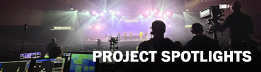
Split Content
This links to the calendar list view. Use an image that is dark and not too busy so that you can read these words. 130 char. max.

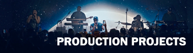
Split Content
Some words about what the page they are going to will be about. Keep it short, sweet, and informal. Get some keywords in for SEO.
This Heading Is H5
It is not used very often. Notice that it maintains the case you type rather than converting it to all upper case.
This is the H6 style
H6 should not be used in any body copy. It is only used in for CSS styles.
This is a client testimonial. Press return after the last line of text to add a space before the name. Otherwise the text is styled for you, centered in italics. This block should only be used for testimonials.